

The Opportunity Institute
Logo for The Opportunity Institute, 2019
When The Opportunity Institute approached us about branding, they asked for gravitas. It was a new organization, but one led by leaders with decades of experience and supported by programs with a record of success. But it shouldn't feel stodgy either, they thought. It's an org focused on innovations for the future too. And the logo ought to be clear about the mission, breaking down the barriers to social mobility in this US and creating pathways to success through better education.
Our solution? Marry the old with the new by combining the deep burgundy and block serifs you might expect from a hundred-year-old educational institution with sharp, clean lines and modern icon. And for that icon? The greatest and simplest representation of social mobility, a ladder extending hopefully upward.
In addition to creating this logo, we also developed a comprehensive style guide for OI, with colors, fonts, print collateral, report templates, and styles for the web.
Want a logo like this one?
We love hearing from new orgs doing great work. No project is too big, small, or strange to consider. Click below to contact us. During business hours, we usually respond within an hour.
Contact Us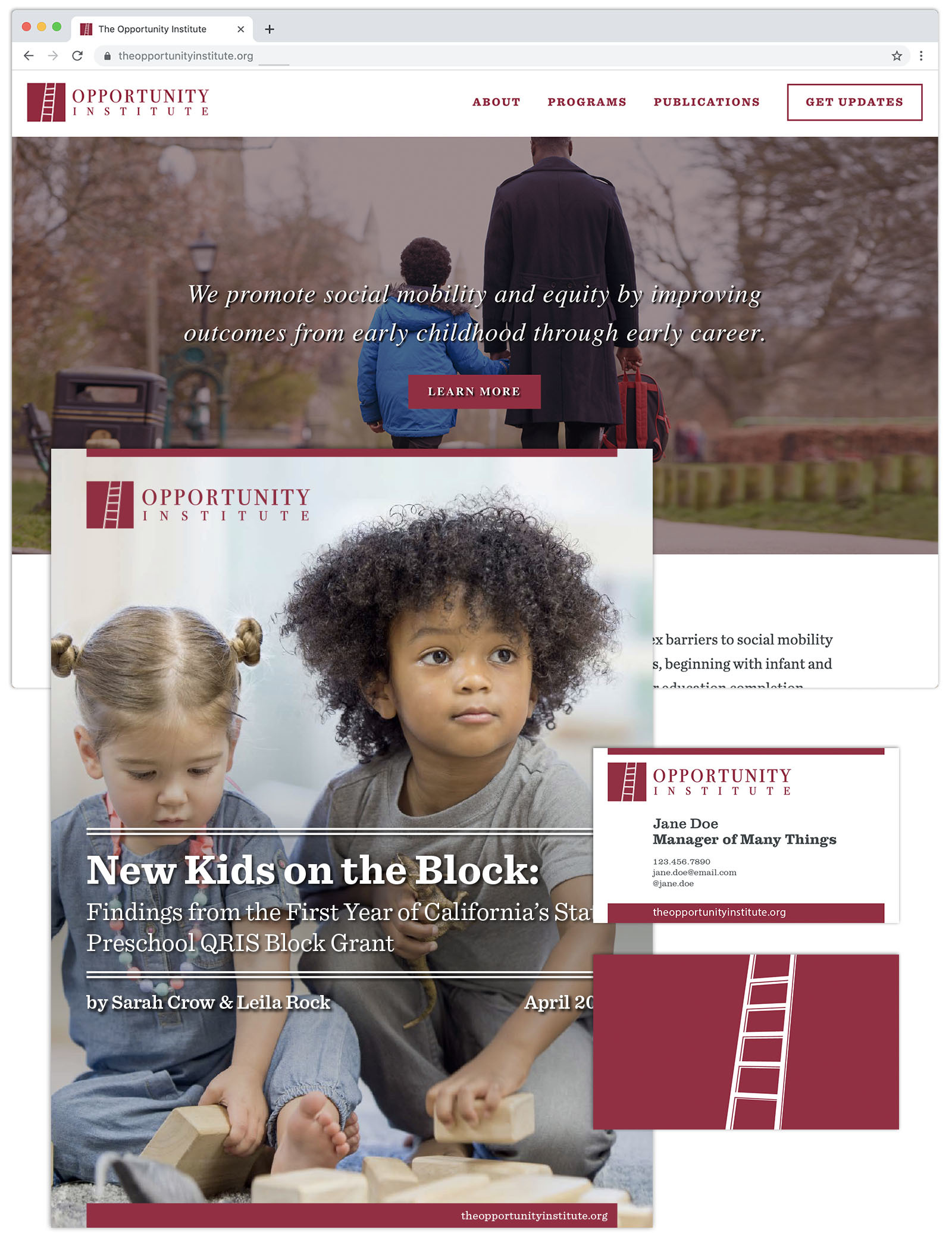
Want a logo like this one?
We love hearing from new orgs doing great work. No project is too big, small, or strange to consider. Click below to contact us. During business hours, we usually respond within an hour.
Contact Us