California Competes
Identity for California Competes, 2018
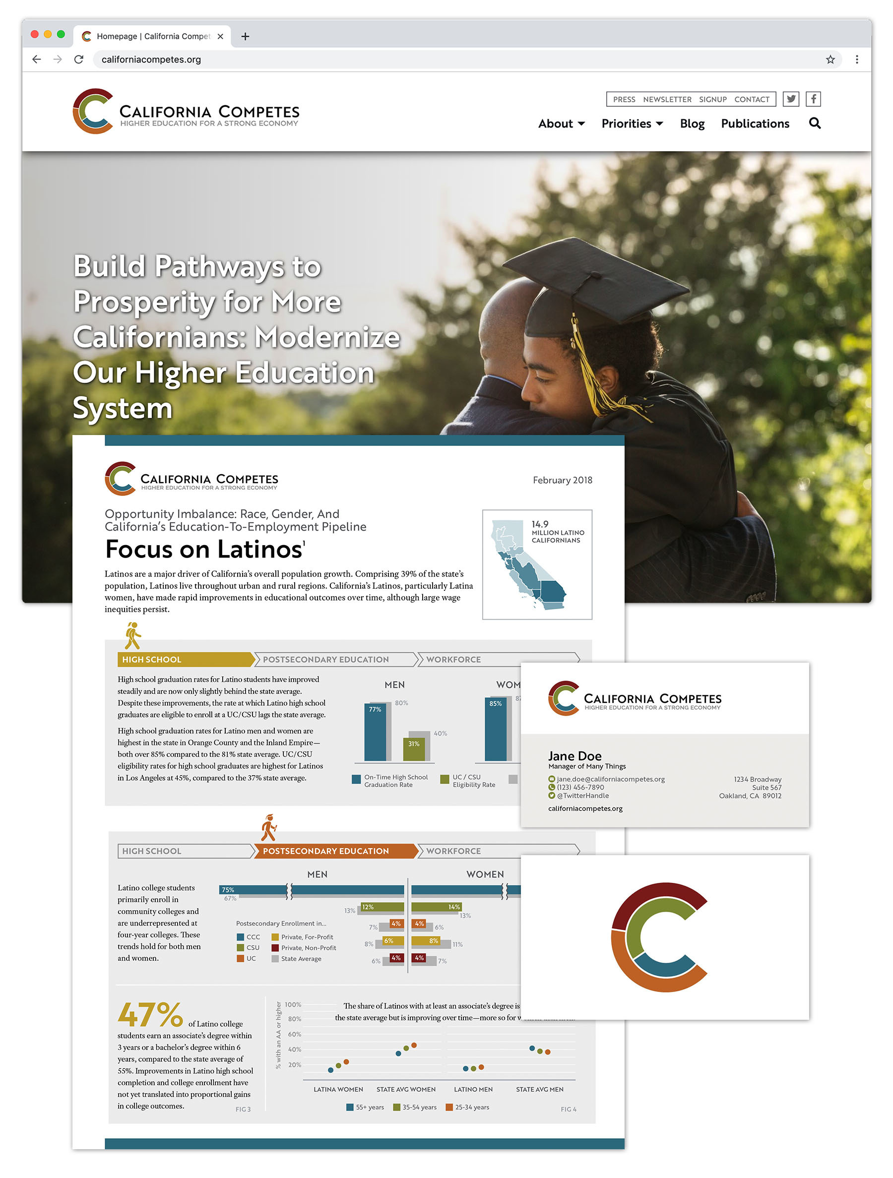
California Competes is an education and workforce policy shop that is light and nimble in their approach, heavy-hitting in their results, and data-driven at every point along the way. When they came to us to design their logo, we decided that data should be central to the new mark, but that it should also not toward their focus on diversity, equity, and inclusion. To that end we developed an icon for them that works on the levels. Joining two Cs together we have the initials of the organization. Dividing those letters into segments, we create the outline of a donut chart, a commonly used tool in their work. And by shading them with a rainbow of different colors, we hint at the idea of different groups coming together. Finish it all up with a sharp, modern logotype to indicate the precision of their work, and you've got this the new face of California Competes.
Want an identity like this one?
We love hearing from new orgs doing great work. No project is too big, small, or strange to consider. Click below to contact us. During business hours, we usually respond within an hour.
Contact Us
Want an identity like this one?
We love hearing from new orgs doing great work. No project is too big, small, or strange to consider. Click below to contact us. During business hours, we usually respond within an hour.
Contact Us

