Postsecondary to Prosperity
Data Viz for California Competes, 2020
For this, our most ambitious data visualization project to date, California Competes approached us with a tall order:
- Create an interactive dashboard for each of California's 12 regions
- Chart educational access and attainment as well career and life outcomes across more than 30 different measurements
- Disaggregate each measurement into a dozen or more demographic groups
Off the shelf tools for data-viz exist, but none could achieve California Competes unique vision, so we coded our own in javascript, loading data from CSVs, building charts dynamically in D3, and allowing content managers control over every chart's data, colors, icons, and descriptive text by integrating it all into their existing Craft CMS website control panel. That last point about the content management system matters, because it means the team at California Competes doesn't just have control over the regions and charts that exist now, but also the ability to create as many more within the same templates as they like, today, tomorrow, or anytime in the future.
To compliment this work, we also created a feature length report and 20 data dense factsheets for deep dives on each region and demographic group. Finally, we helped California Competes create a video and webinar to show off their excellent work.
Want a data viz like this one?
We love hearing from new orgs doing great work. No project is too big, small, or strange to consider. Click below to contact us. During business hours, we usually respond within an hour.
Contact Us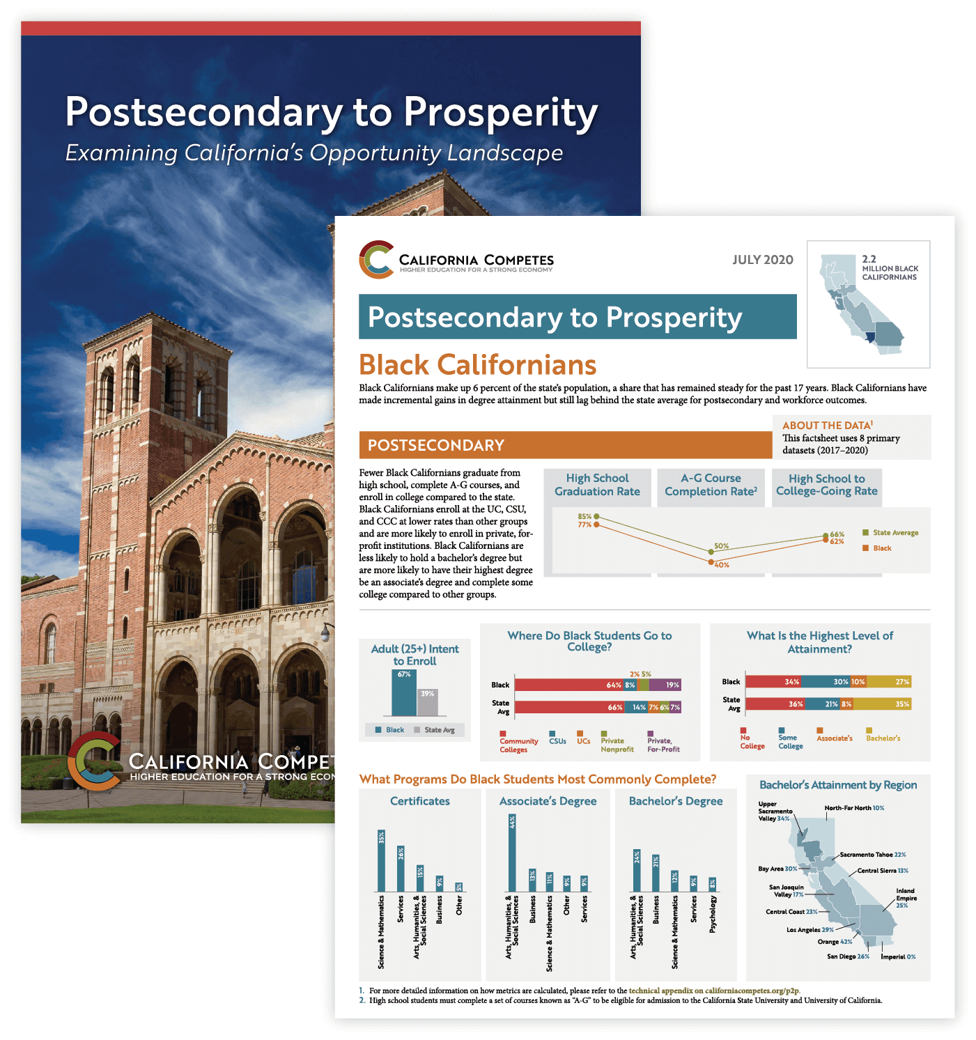
Want a data viz like this one?
We love hearing from new orgs doing great work. No project is too big, small, or strange to consider. Click below to contact us. During business hours, we usually respond within an hour.
Contact Us